I have decided to make a small change to the back of my album cover after receiving feedback that suggested the titles of the songs were placed too close together, making it hard for everyone to read. I can understand this so I have slightly spaced out the text more, so that hopefully it is easier to read.
A2 Music Video Project
Sunday, 13 February 2011
Thursday, 3 February 2011
Commentary
This is a commentary of my video. I have created a video to go with it so that the visuals relate to what I am saying.
Untitled from Sarah Hall on Vimeo.
Monday, 24 January 2011
Improved final ancillary products
After doing my evaluation i have looked back at my products and seen that I could probably add some little details to make my product seem more professional. I have done this through adding a bar code onto my CD and a release date on my poster. I have also changed the font on the back of my CD cover to fit in with the rest of the products.
Saturday, 15 January 2011
Monday, 10 January 2011
My Final Ancillary Products
These are my final ancillary products. They link together with the fonts, colour scheme and through the images shown, which together, create the super hero's clothing. I have added a border to make the products stand out more. The colours are bright and eye catching which also links to the genre. I have kept the design fairly simple which I feel helps the image stand out and this would make them more attractive to my audience. If i had something that had a lot going on with many images it would also link to the genre, however i feel this simple approach is better and possibly more quirky. The images are not taken directly from the video so it doesn't give much away about the actual video. the images link to the story line of a secret identity that it associated with super hero image. Both of the products are framed by quirky text which links to the genre and they are a large size which is easy for the audience to see.
Friday, 7 January 2011
Sunday, 2 January 2011
Editing- Adding transitions that can change the mood
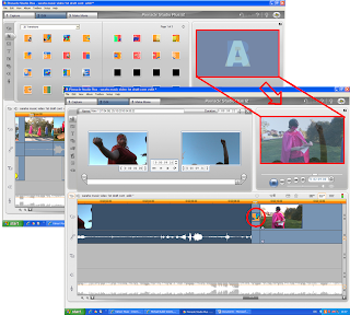
This shows another editing transition process. It also shows how effective transitions can be in changing the mood of the video. This comes at the point when the pace of the song changes, becoming slower, using the concept of superhero's, I wanted to add some humour by making it slower and dramatic. I did this by adding a slow fade transition, that also merged the two clips together. I did this through choosing the transition from the menu shown on the first image that lies behind, the square with an A in gives a preview of what the transition is and the lower image shows the outcome. I dragged the transition down onto the video I was created as shown at the bottom in the red circle.
Subscribe to:
Posts (Atom)